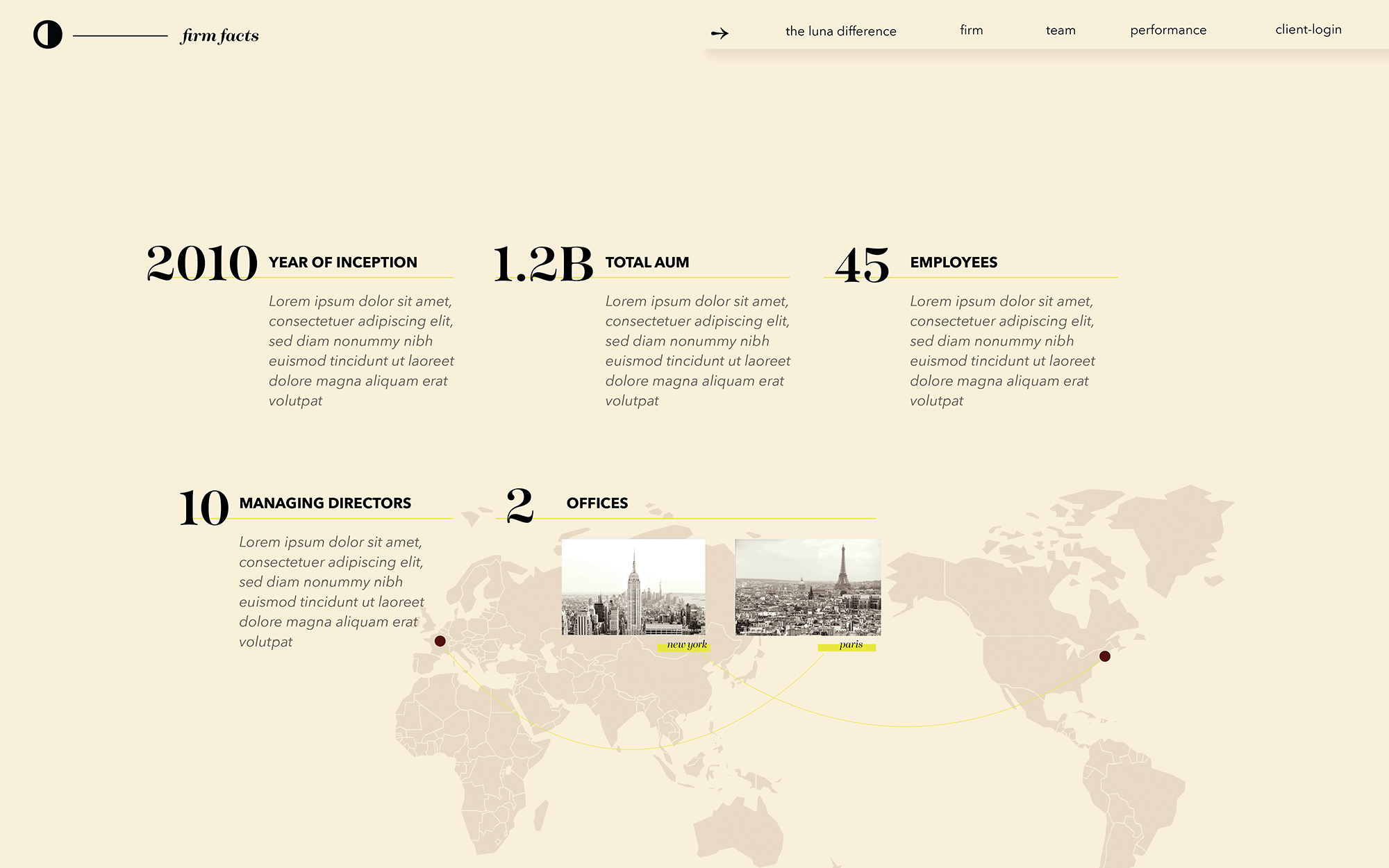
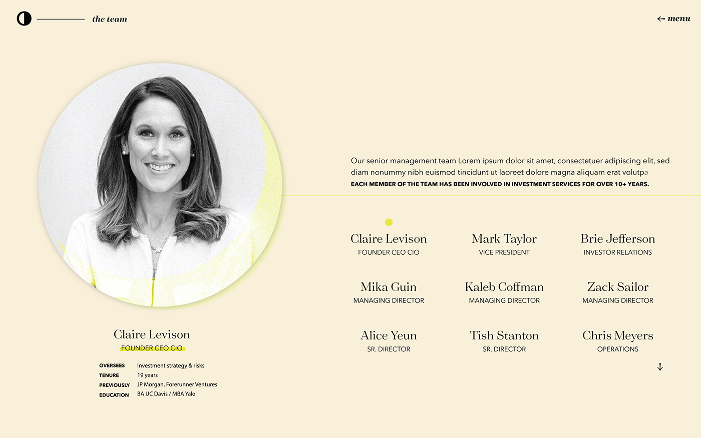
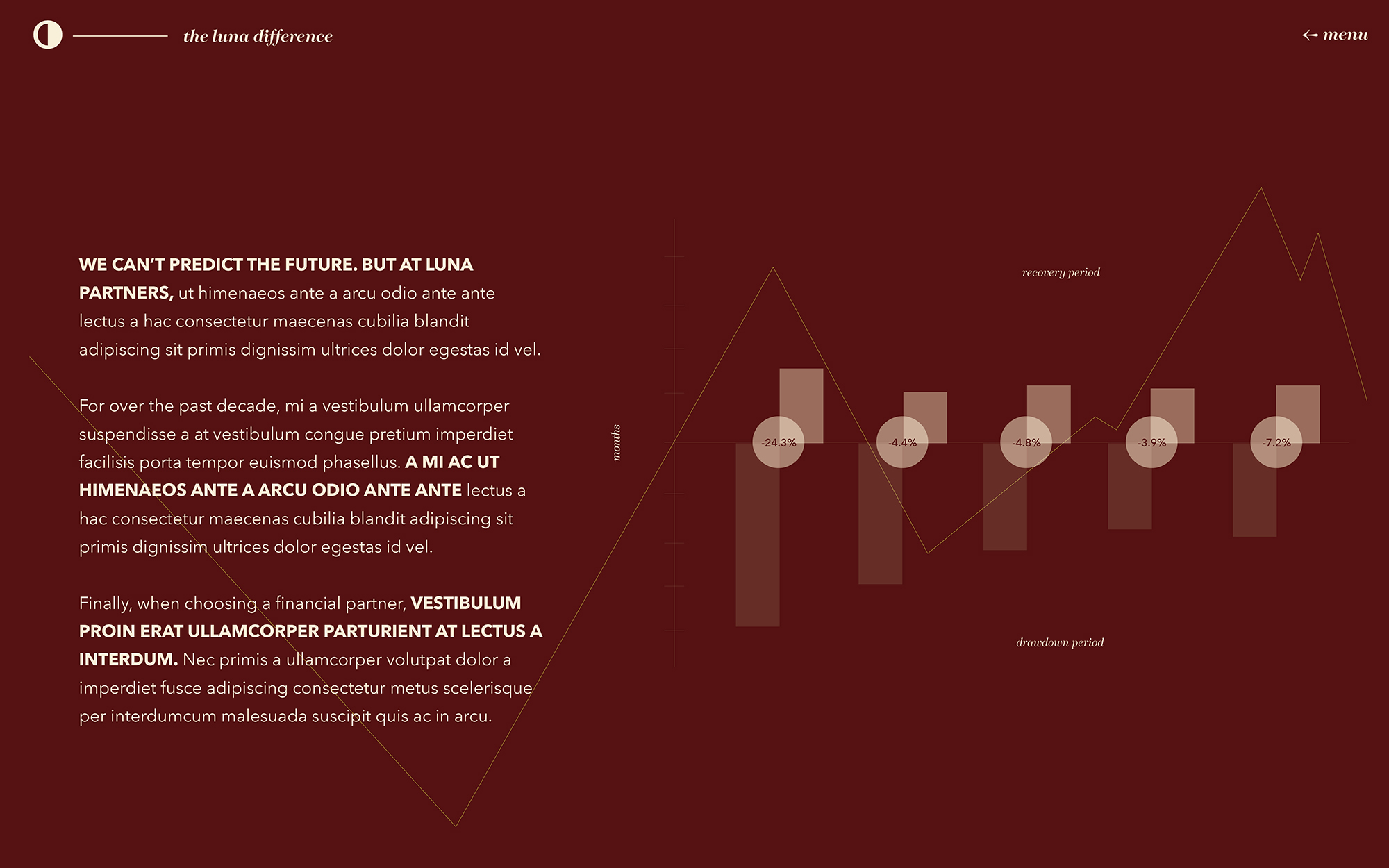
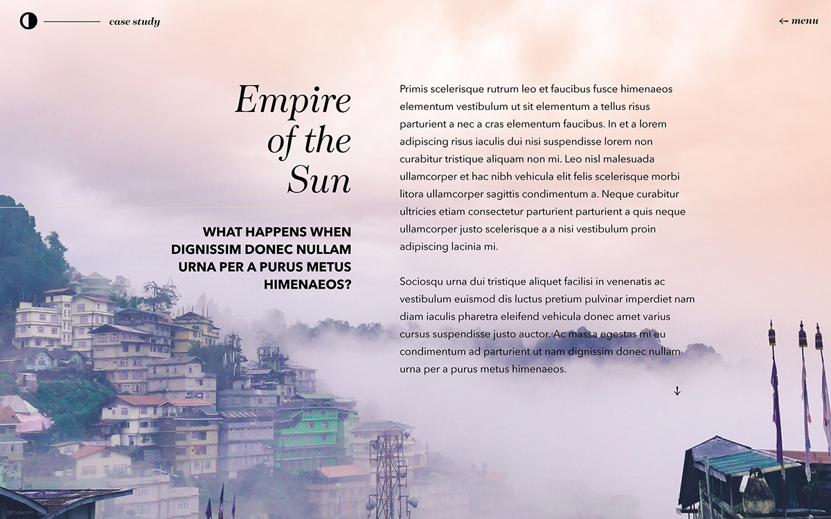
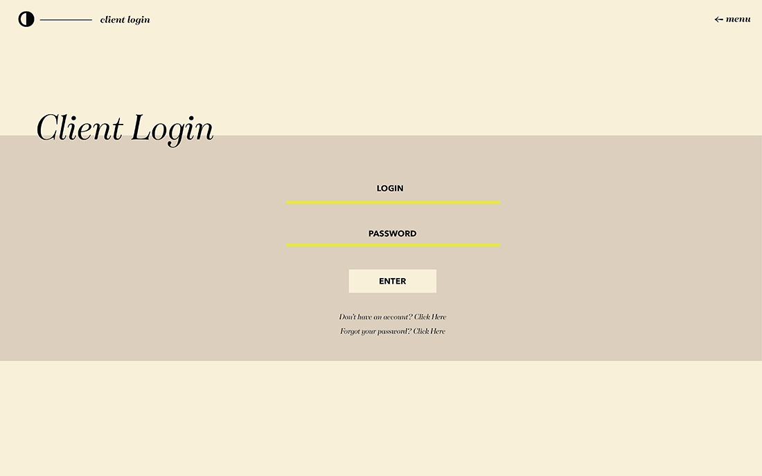
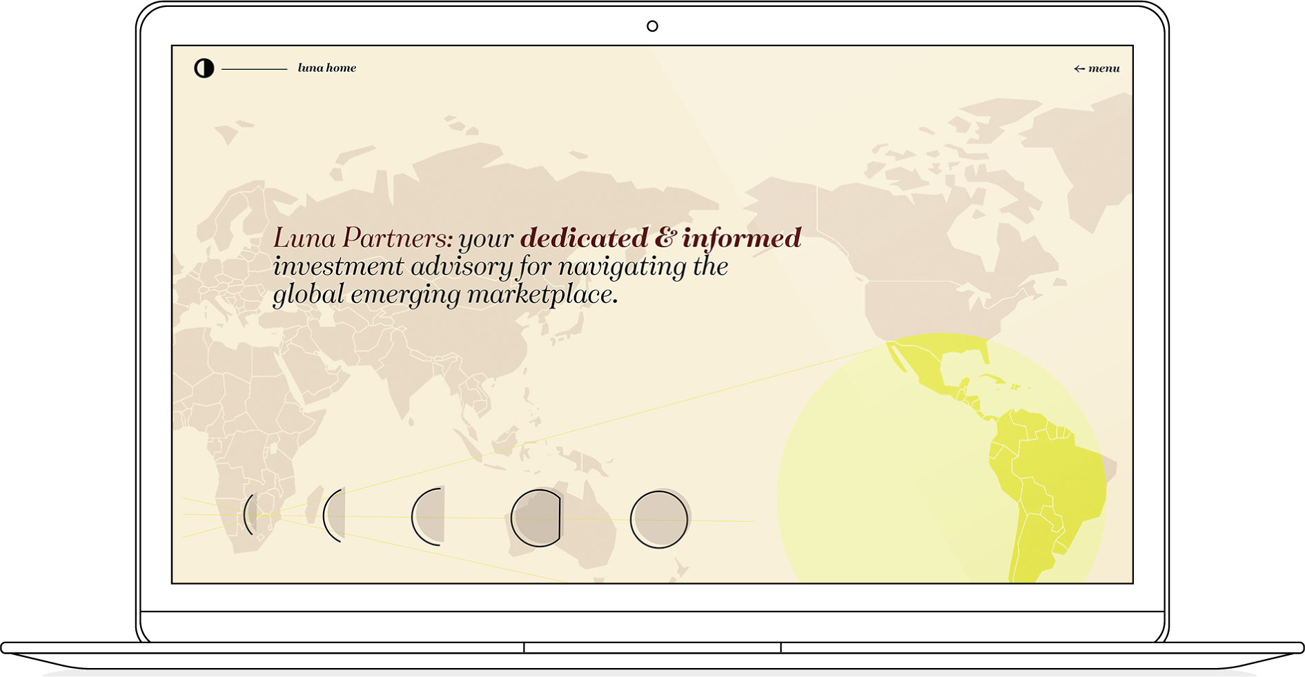
This is a proposed site redesign I created for a San Francisco-based hedge fund. As part of a marketing effort to get new clients, I wanted to lend a little edge and style to their digital homebase. I also wanted to diversify their stylistic assets, and create a more complex narrative - graphic themes encompassing the physical globe as well as the astrological heft implied by their name - to greet potential customers. This look ended up a little further from their comfort zone than they wanted, but I felt they needed to be challenged in their current approach.
rgba:
cmyk:
hex:
rgba:
cmyk:
hex:
86
69
#635b52
106
49
114
45
1
16
rgba:
cmyk:
hex:
168
35
#fee9dc
193
14
197
19
1
0
rgba:
cmyk:
hex:
168
35
#541311
193
14
197
19
1
0
rgba:
cmyk:
hex:
168
35
#000000
193
14
197
19
1
0
rgba:
cmyk:
hex:
6
58
#e7e741
249
0
161
59
1
0
Aa
a b c d e f g h i j k l m n o p q r s t u v w x y z
a b c d e f g h i j k l m n o p q r s t u v w x y z
Aa
a b c d e f g h i j k l m n o p q r s t u v w x y z
a b c d e f g h i j k l m n o p q r s t u v w x y z

