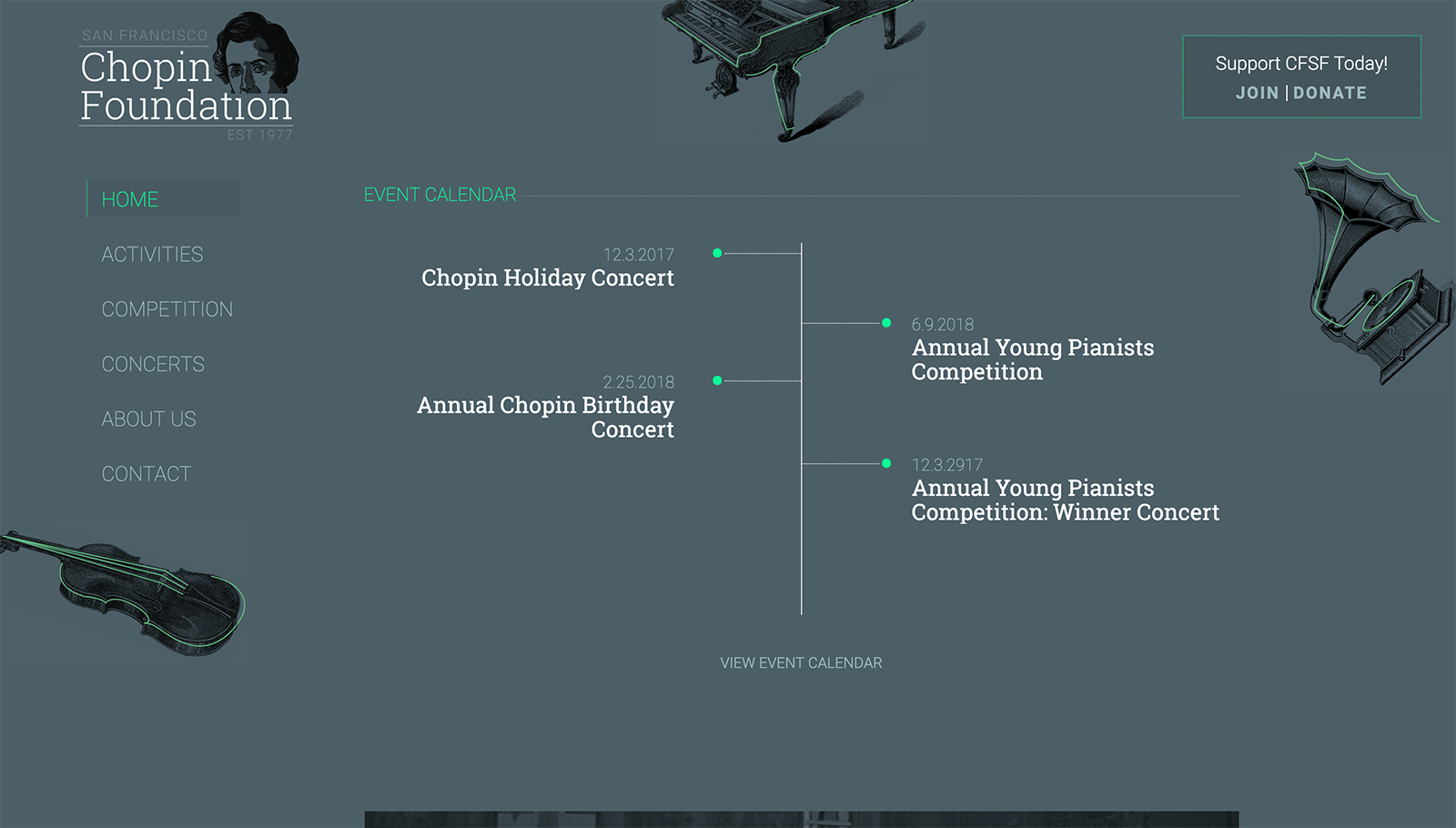
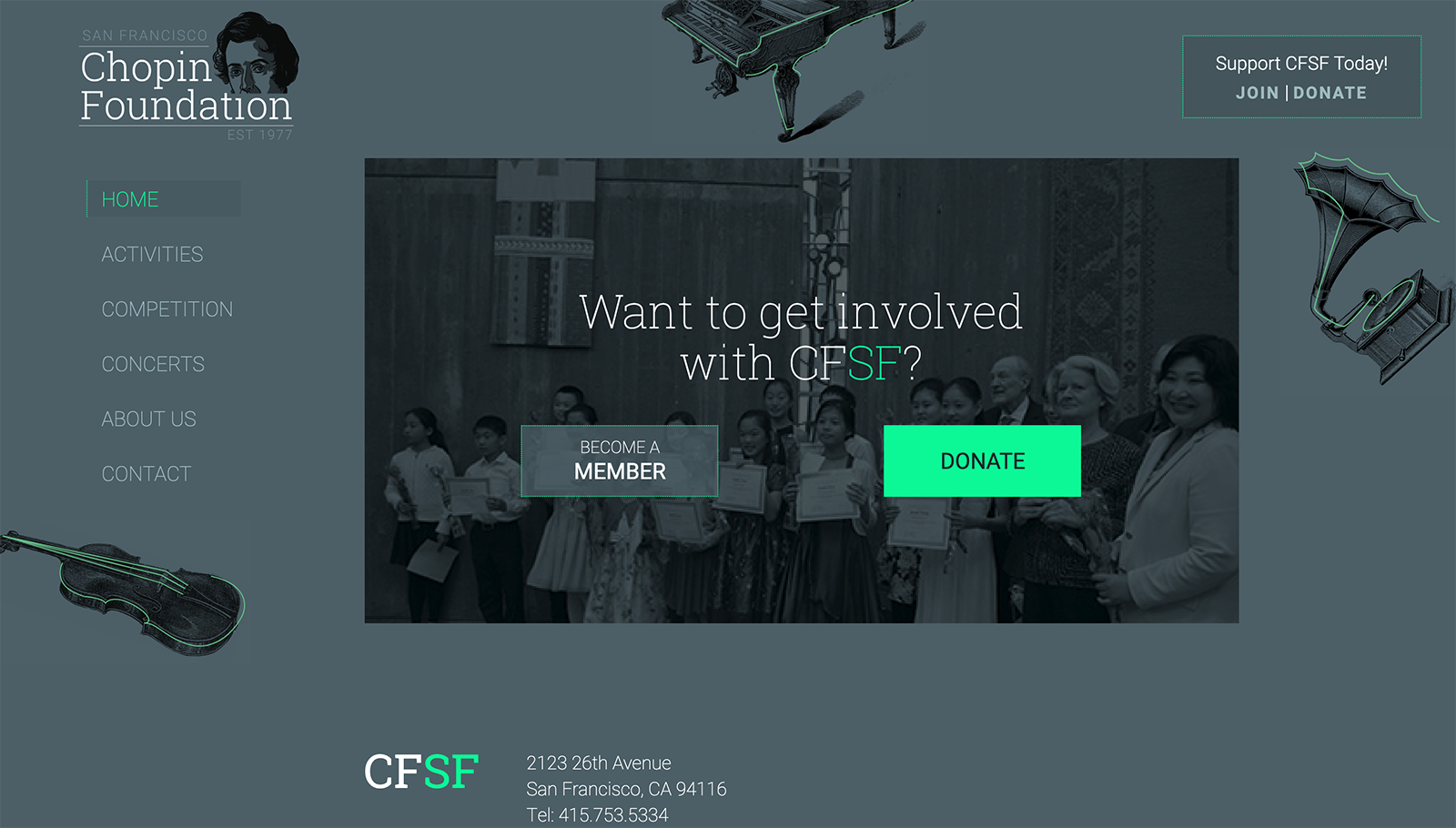
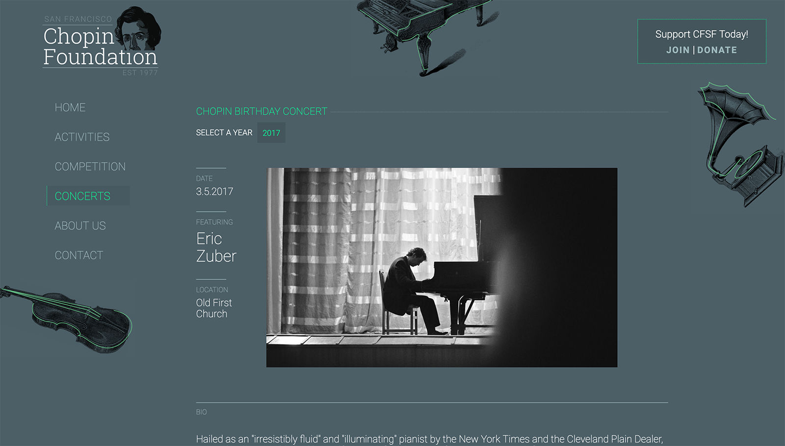
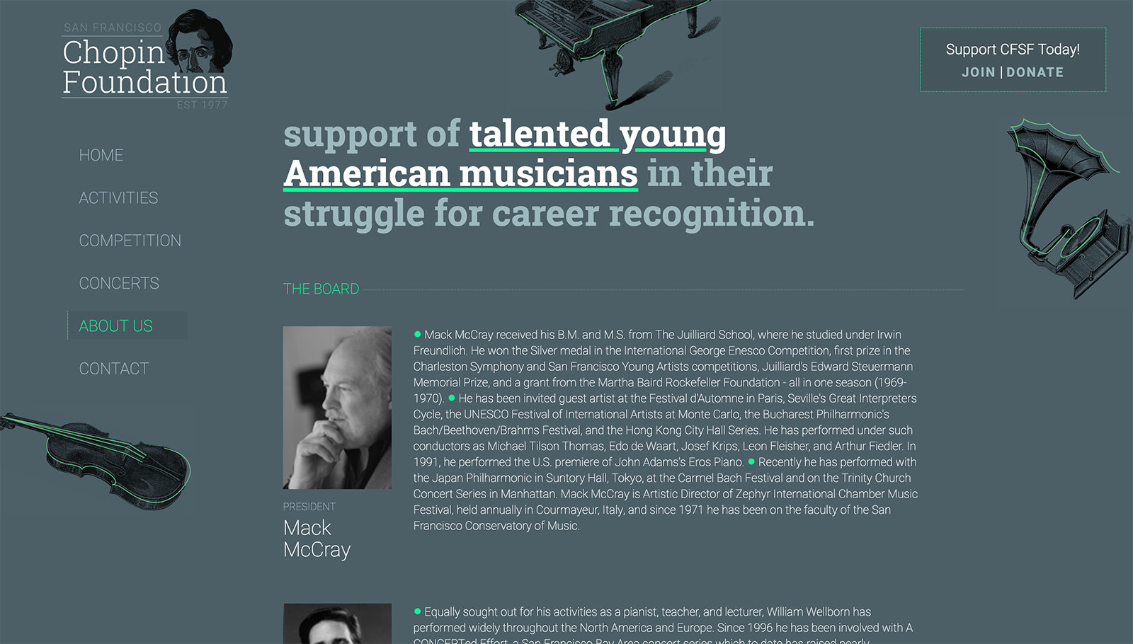
The Chopin Foundation of San Francisco came to me with a challange: how to redesign their website and collateral to balance the serious intent of their philosophy, while appealing to their young, increasingly tech-savvy students? I wanted to give them a look that felt fresh and a bit playful, while still honoring the canon of classical music without reverting to staid visual cliches. It would be important for a young musician to visit the site and find an experienced tailored to their digital expectations, without sacrificing the foundation's core mission. The typeface is structured, while a flourecent green pop of color guides the eye - and of course, there is a cheeky little picture of herr composer himself peeking over the top just to make sure everything is in order.
rgba:
cmyk:
hex:
rgba:
cmyk:
hex:
86
69
#0e1278
106
49
114
45
1
16
rgba:
cmyk:
hex:
168
35
#a8c1c5
193
14
197
19
1
0
rgba:
cmyk:
hex:
6
58
#06f9a1
249
0
161
59
1
0
Aa
a b c d e f g h i j k l m n o p q r s t u v w x y z
a b c d e f g h i j k l m n o p q r s t u v w x y z
Aa
a b c d e f g h i j k l m n o p q r s t u v w x y z
a b c d e f g h i j k l m n o p q r s t u v w x y z
